allow us to reintroduce ourselves
Here at Overstreet Associates, we are often recognized as a fun, creative team that has a genuine care for our clients. Passionate, hard-working, knowledgeable, and responsive is how we operate. It is how we work with our clients. It is who we are. It should, therefore, come as no surprise, that our visual personality would resemble the same likeness.
With that said, we would like to take this opportunity to share with you who we are through the visual context that is our brand and explains how our identity reflects the people, processes, and products of this company.
 Shown here are the three logo variations of color, each with its own sets of orientations and usage. The medium of usage for each, from left to right, is digital, signage and print.

And a medium is nothing without a message. We believe that it is one thing to have the right message but it is how we choose to deliver it that binds our relationships with each other and our clients.

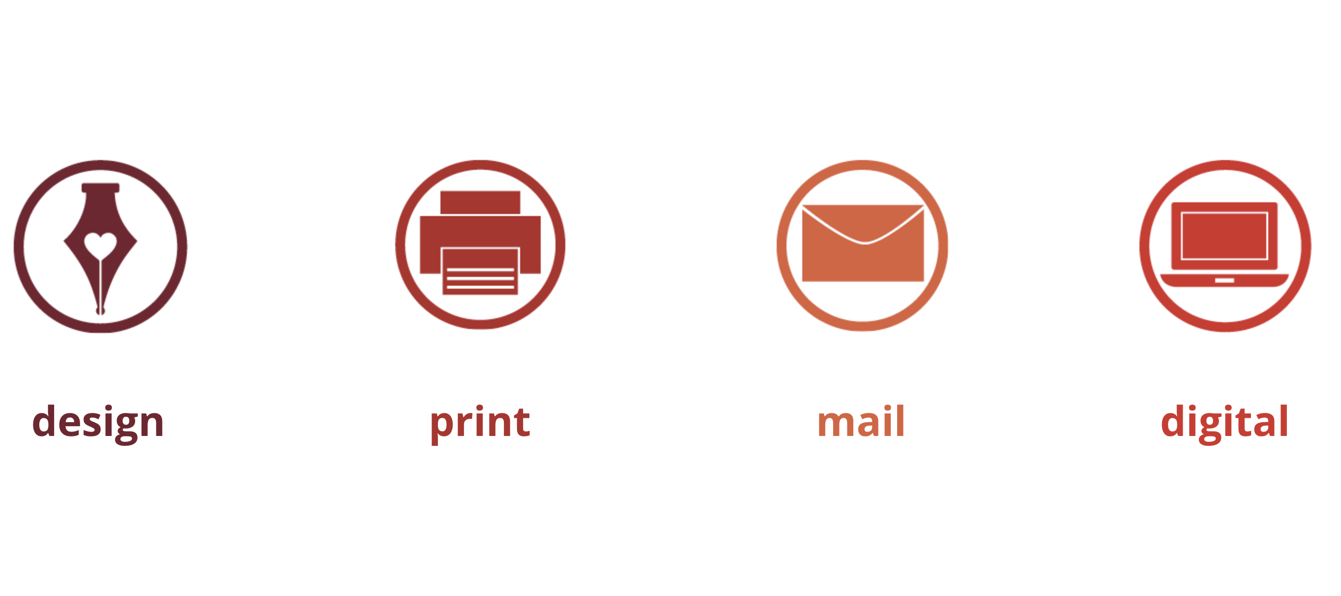
DPMD (Design, Print, Mail and Digital) explains what we do. It is a short, direct message that covers the services that we offer to our clients.

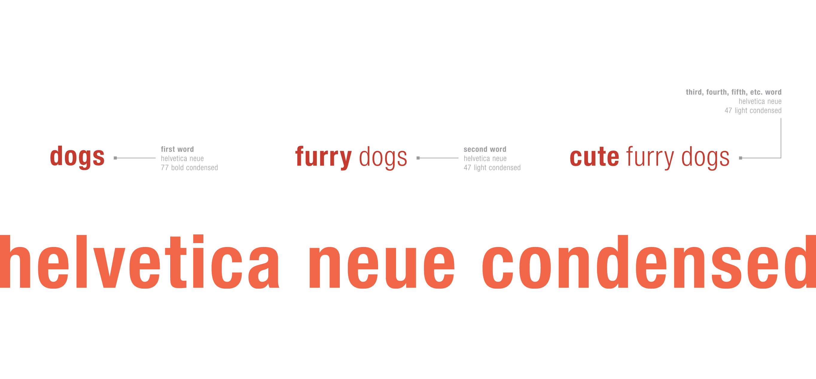
A visual identity is never complete without consistent use of typography. We read, type and print in Helvetica Neue Condensed. Like our logo, we combine bold and light styles to create an interesting contrast and for easy reading.

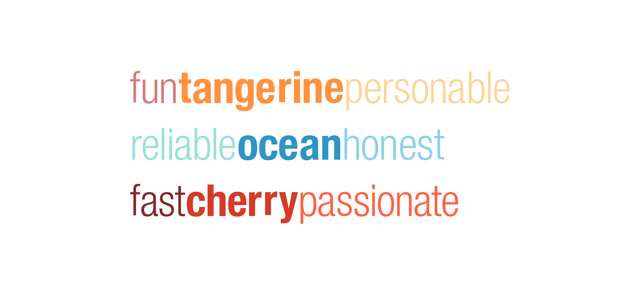
We have 3 color palettes, each of which defines us and speaks to our personality and company culture. Similar to our logos, the color palettes are applied based on mediums: Tangerine for print, Ocean for signage and Cherry for digital.
As we live in a time of innovation, after being in the market for over three decades, we understand that passion, hard-work and honesty will always continue to carry through time.
Thank you for taking the time to get to know us a little better, on how our visual identity represents who we are as a company and culture and we looking forward to sharing more with you of what is ahead.
 Words by Anne Nguyen
Senior Designer
